Plotting and colors#
We’ve already covered a lot on plotting in the previous tutorials. This tutorial is mostly a review of the material covered already, plus a few new tools to use.
Click here to open an interactive version of this notebook.
Plots#
Basic plotting#
First, let’s make a plot using standard Matplotlib, then import Sciris and make the same plot:
[1]:
import numpy as np
import pylab as pl

n = 1000
x = np.arange(n)
y = np.random.rand(n)
c = np.sqrt(x*y)
kwargs = dict(x=x, y=y, s=100, c=c, alpha=0.2)

# Vanilla Matplotlib
f1 = pl.scatter(**kwargs)
pl.show()

# Chocolate Sciris
import sciris as sc
sc.options(jupyter=True)
f2 = pl.scatter(**kwargs)

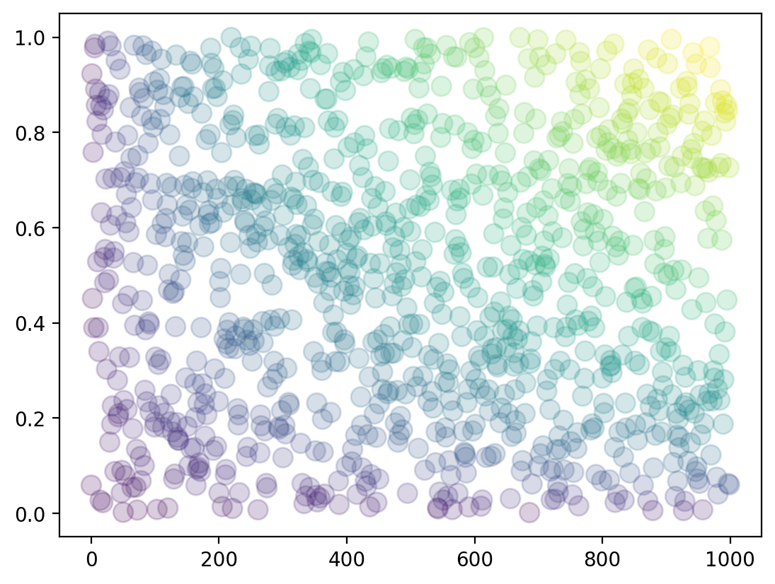
See how the Sciris version is much sharper? If Sciris detects that Jupyter is running (sc.isjupyter()), it switches to the higher-resolution backend 'retina'. But, if you really like blurry plots, you can set sc.options(jupyter=False). We won’t judge.
Plotting styles#
By default, Sciris uses higher resolution both for display and saving. But it also has two other built-in styles, simple and fancy, that you can call just like any other Matplotlib style:
[2]:
def demo_plot(label, npts=100, nlines=5):
    fig = pl.figure()
    for i in range(nlines):
        np.random.seed(i+1)
        pl.plot(np.cumsum(np.random.randn(npts)), alpha=0.7, label=f'Seed {i}')
    pl.title(f'{label} style')
    pl.legend()
    return

for style in ['default', 'sciris.simple', 'sciris.fancy']:
    with pl.style.context(style): # Use a style context so the changes don't persist
        demo_plot(style)
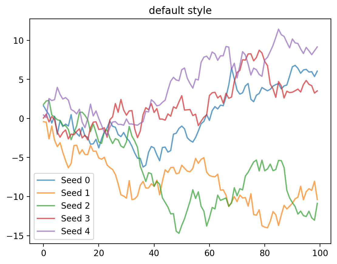
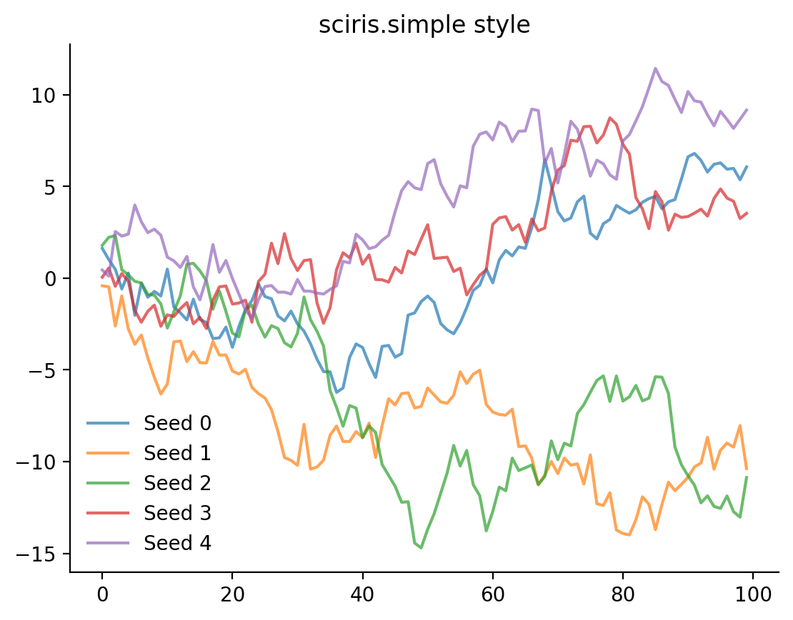
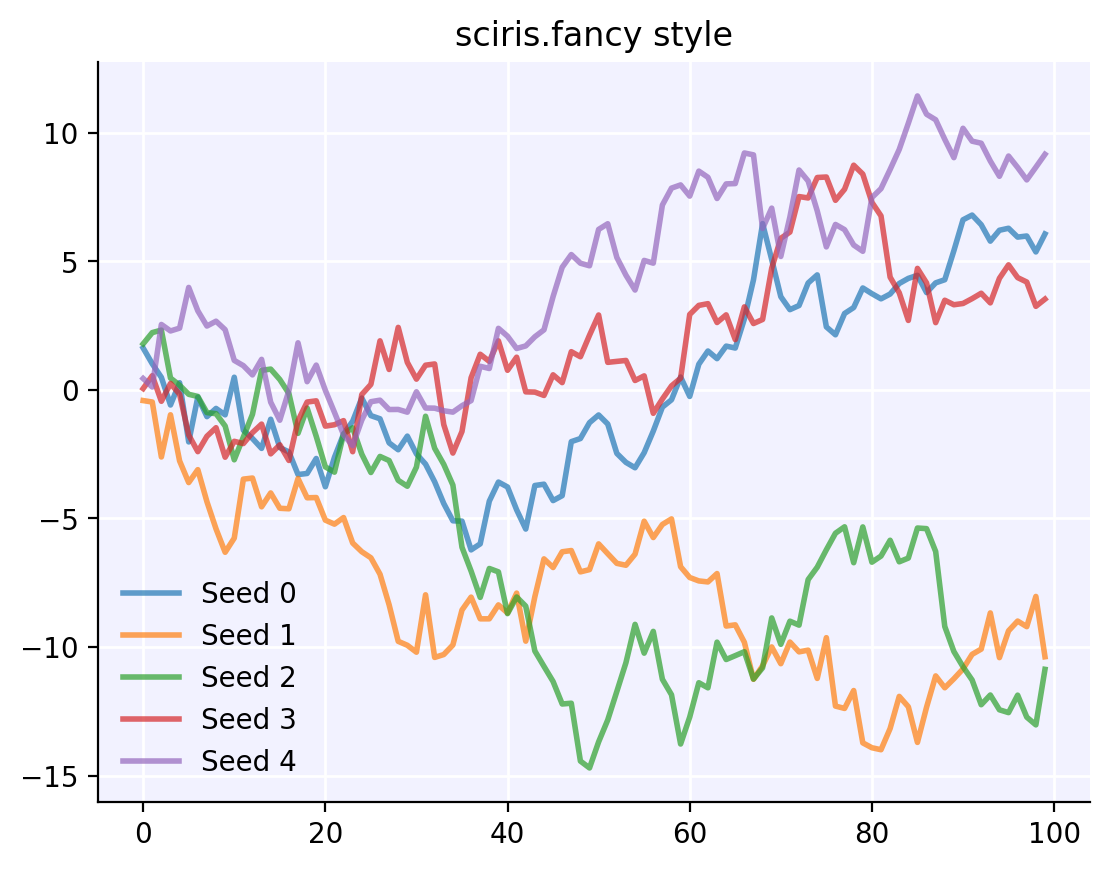
The “simple” style is close to Matplotlib’s defaults (just without boxes around the axes and legend, more or less), while the “fancy” style is close to Seaborn’s default.
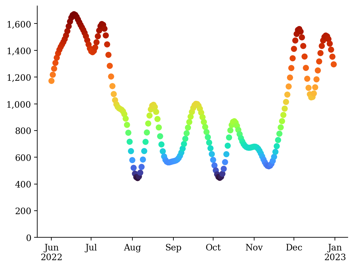
Plot configuration#
One of the fun-but-annoying things about plots is that they’re so customizable: no two plots are ever exactly the same. (One hopes.) Sciris has a lot of options for configuring plots. Here are some of the most commonly used ones, which are hopefully more or less self-explanatory:
[3]:
sc.options(font='serif') # Change font to serif
x = sc.daterange('2022-06-01', '2022-12-31', as_date=True) # Create dates
y = sc.smooth(np.random.randn(len(x))**2)*1000 # Create smoothed random numbers
c = sc.vectocolor(np.log(y), cmap='turbo') # Set colors proportional to squared y values
pl.scatter(x, y, c=c) # Plot the data
sc.dateformatter() # Automatic x-axis date formatter
sc.commaticks() # Add commas to y-axis tick labels
sc.setylim() # Automatically set the y-axis limits, including starting at 0
sc.boxoff() # Remove the top and right axis lines
sc.options(font='default') # Reset font to default after plotting
Advanced plotting options#
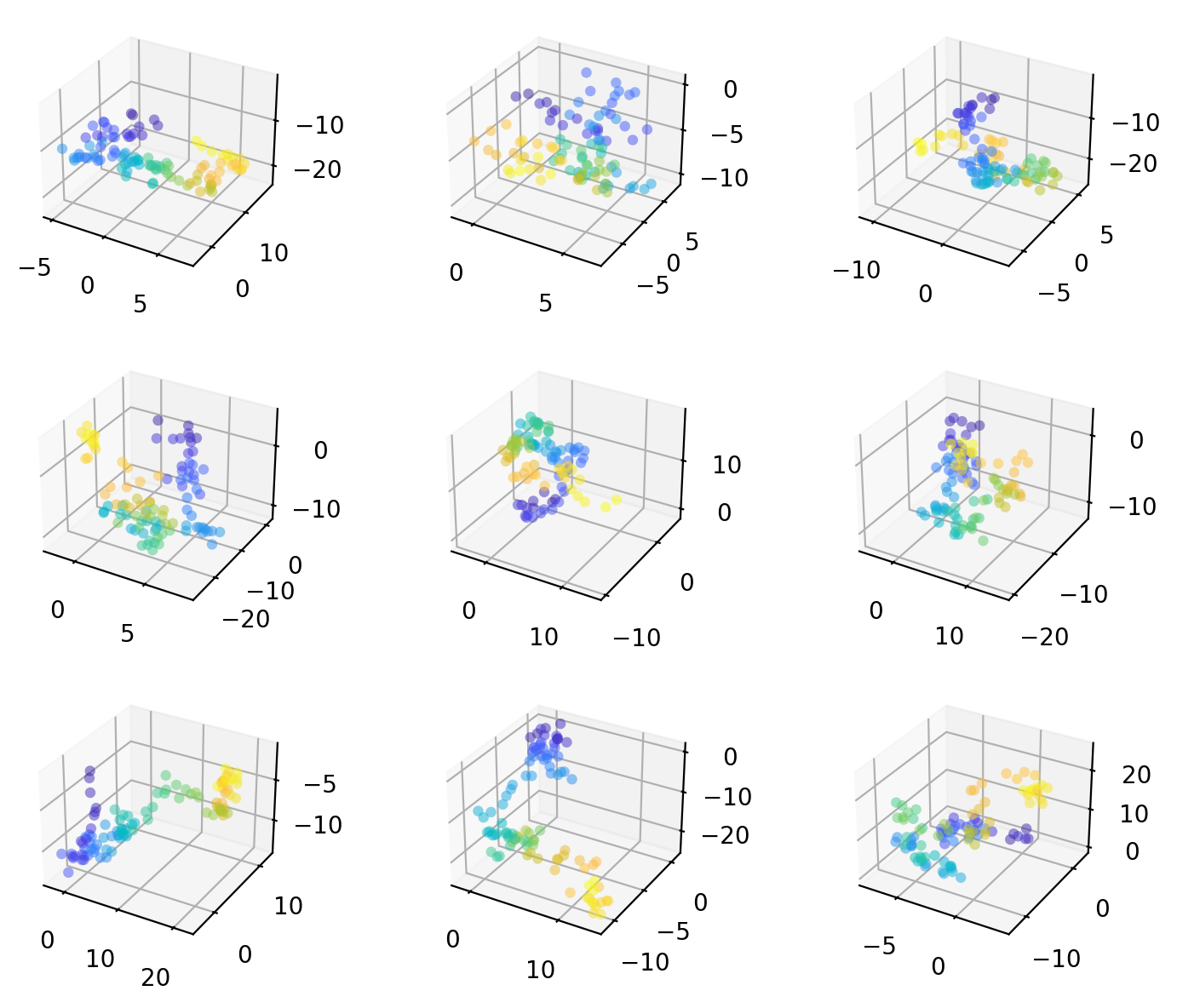
Do you ever have, say, 14 plots, and have to think about how to turn that into a grid of subplots? sc.getrowscols() will solve that problem for you. Speaking of subplots, by default Matplotlib has a lot of wasted space; sc.figlayout() will convert the figure to “tight” layout, which (usually) fixes this. Finally, since 3D plots are cool, let’s do more of those.
Putting it all together:
[4]:
class Squiggles(sc.prettyobj):

    def __init__(self, n=9, length=100):
        self.n = n
        self.length = length

    def make(self):
        self.d = sc.objdict() # Create objdict to store the data
        for k in ['x', 'y', 'z']:
            self.d[k] = np.cumsum(np.random.randn(self.n, self.length), axis=1)
        self.c = sc.vectocolor(np.arange(self.length), cmap='parula') # Make colors

    def plot(self):
        d = self.d
        nrows,ncols = sc.getrowscols(self.n) # Automatically figure out the rows and columns
        pl.figure(figsize=(8,6))
        for i in range(self.n):
            ax = pl.subplot(nrows, ncols, i+1, projection='3d')
            sc.scatter3d(d.x[i], d.y[i], d.z[i], s=20, c=self.c, ax=ax, alpha=0.5) # Plot 3D
        sc.figlayout() # Automatically remove excess whitespace
        return

sq = Squiggles()
sq.make()
sq.plot()
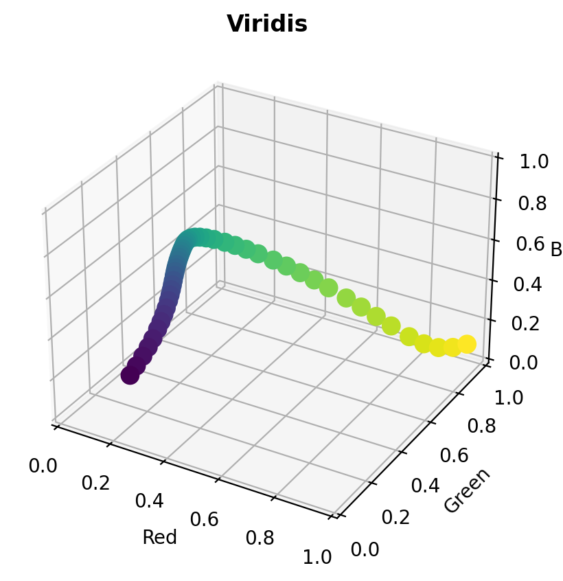
Colors#
We’ve seen a color or two already, but let’s review a couple more tools. You probably know that data tend to be either continuous or categorical. For continuous variables, we want adjacent points to be close together. But for categorical variables, we want them to be far apart.
The main way of creating a continuous colormap in Sciris is sc.vectocolor() (or its 2D equivalent sc.arraytocolor()). In most cases, this is pretty close to what Matplotlib would pick for the color mapping on its own. However, with sc.vectocolor() we have more flexibility.
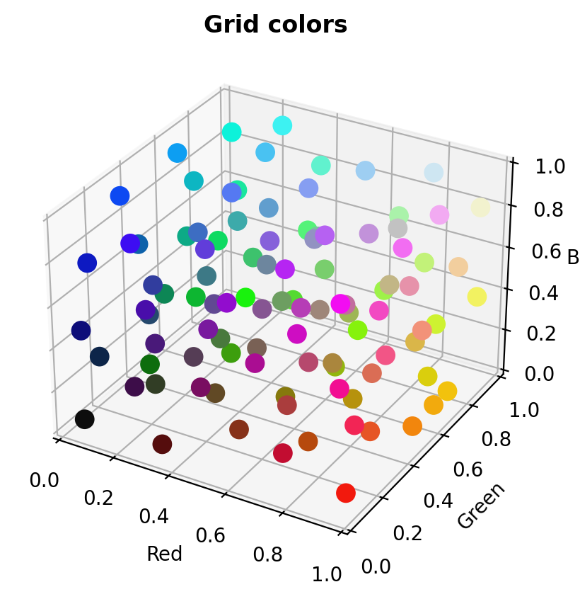
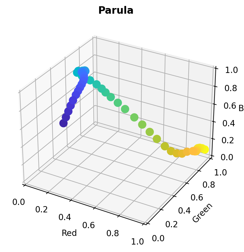
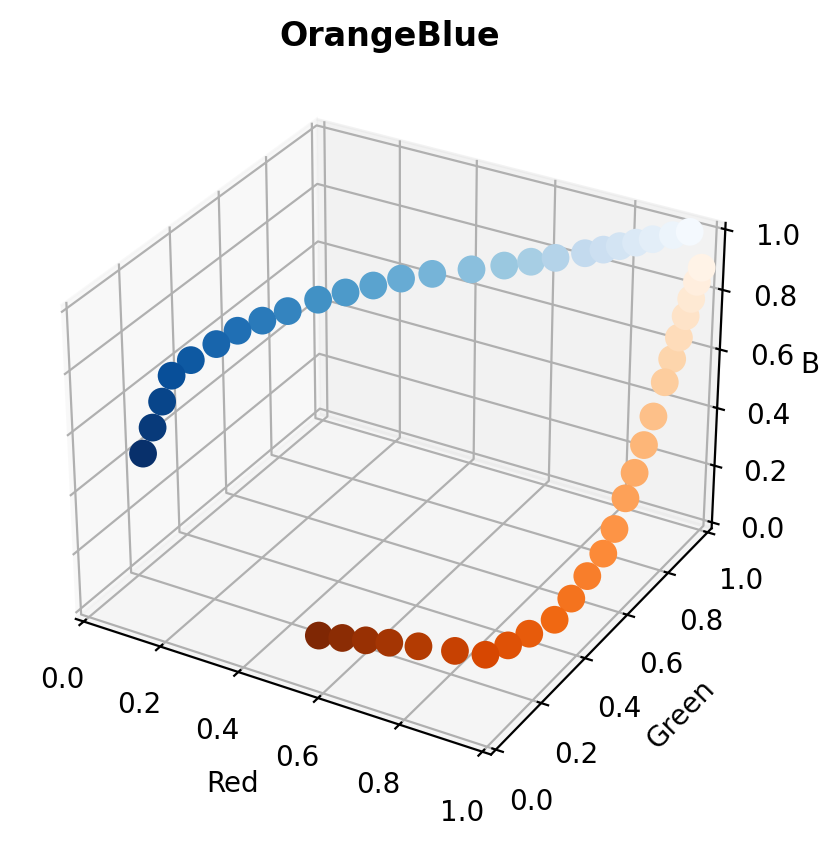
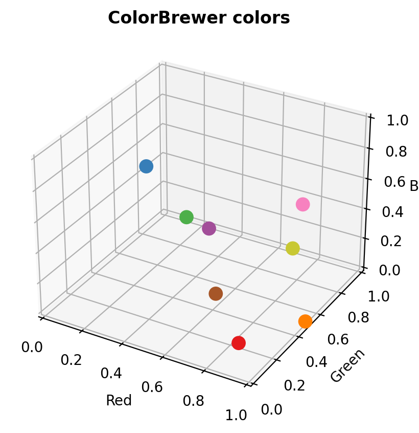
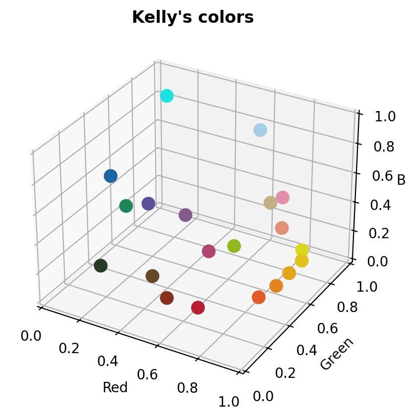
For categorical variables, the main function is sc.gridcolors(). For 9 or fewer colors, it uses the ColorBrewer colors, which are awesome. For 10-19 colors, it uses Kelly’s colors of maximum contrast, which are also awesome. For 20 or more colors, it will create colors uniformly spaced in RGB space.
But a picture is worth 1000 words, right?
[5]:
def colorcube(n=50, title=None, continuous=True):
    if continuous:
        colors = sc.vectocolor(n, cmap=title.lower())
    else:
        colors = sc.gridcolors(n, asarray=True)
    pl.figure()
    ax = sc.scatter3d(colors[:,0], colors[:,1], colors[:,2], c=colors, s=100)
    ax.set_xlabel('Red')
    ax.set_ylabel('Green')
    ax.set_zlabel('Blue')
    ax.set_xlim((0,1))
    ax.set_ylim((0,1))
    ax.set_zlim((0,1))
    ax.set_title(title, fontweight='bold')

# Illustrate continuous colormaps
colorcube(title='Viridis')
colorcube(title='Parula')
colorcube(title='OrangeBlue')

# Illustrate categorical colormaps
colorcube(n=8,   title='ColorBrewer colors', continuous=False)
colorcube(n=20,  title="Kelly's colors",     continuous=False)
colorcube(n=100, title='Grid colors',        continuous=False)
<Figure size 640x480 with 0 Axes>
<Figure size 640x480 with 0 Axes>
<Figure size 640x480 with 0 Axes>
<Figure size 640x480 with 0 Axes>
<Figure size 640x480 with 0 Axes>
<Figure size 640x480 with 0 Axes>